Defining and choosing image aliases in Ibexa DXP 4.x for responsive images
By: Tim Yeung | March 26, 2026 | developer tools and alias
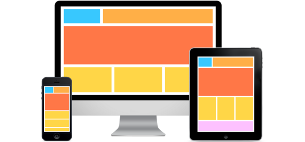
Responsive images are a cornerstone of modern web design. They enable websites to deliver optimized visuals that adapt seamlessly to a wide range of devices, screen sizes, and resolutions. By serving appropriately sized images based on the user’s device capabilities, responsive images ensure fast load times, reduced bandwidth usage, and a consistent visual experience.
In Ibexa DXP 4.x, the image alias system (powered by the LiipImagineBundle) provides a robust framework for managing these variations, but requires careful configuration to balance flexibility and efficiency.
In a recent project, our team developed a streamlined approach to define reusable image aliases that provides a clear practice for selecting the right alias for responsive designs.
Why responsive images matter
Responsive images adapt to different screen sizes, resolutions, and devices, offering:
- Visual consistency. Tailored sizes and ratios ensure clarity across breakpoints.
- Design fidelity. Images align with the designer’s vision, maintaining a polished look.
- Performance. Appropriately sized images reduce load times, improving user experience and SEO.
- Bandwidth efficiency. Optimized images minimize data usage, especially for mobile users.
Image aliases, called image variations in Ibexa DXP 4.x, generate multiple versions of an uploaded image, tailored for specific use cases, such as thumbnails, hero images, or content cards. Image aliases in the system use the LiipImagineBundle to apply filters, resize, crop, or optimize images to fit the different display needs of the content. This process is designed to be efficient; variations can be generated once and reused across the site.
Our practice for managing image aliases
To provide sufficient variety without creating excessive aliases, we developed a system that categorizes variations by aspect ratios and widths, uses a clear naming convention, and aligns with Bootstrap’s grid system for selecting the right alias in responsive designs.
Defining aliases for sufficient variety with aspect ratios
We categorize aliases into five aspect ratios to cover most design scenarios:
- Square (1:1): Used for thumbnails, avatars, or square cards.
- Standard (4:3): Ideal for traditional photography or blog content cards.
- Wide (16:9): Perfect for hero banners or widescreen media displays.
- Full: Used when you want to scale an image while respecting its original aspect ratio. For example, a body image.
- Original: When you want to display the image without any resizing or cropping.
For Square, Standard, and Wide, we use the thumbnailgravityfilter/center filter to resize and crop images to exact dimensions. For Full, we use geometry/scalewidthdownonly to scale images within specified dimensions without cropping or upscaling, preserving the original aspect ratio. For further details on configuring aliases and custom filters, see Image aliases and filters in eZ Publish 5.4 and Custom filters for scalemin image variations in Ibexa 4.x.
Defining aliases by widths for responsive breakpoints
We align alias widths with common responsive breakpoints for 1080p and 1440p resolutions, using full, half, third, and quarter widths:
- X-Large: 1080px / 1440px (full width, for large desktops or high-density displays).
- Large: 540px / 720px (half width, for desktops or tablets).
- Medium: 360px / 480px (third width, for tablets or small desktops).
- Small: 270px / 360px (quarter width, for mobile devices)
Each aspect ratio (Square, Standard, Full, Wide) is applied to these width categories to generate aliases tailored for common breakpoints (for example, 270px, 360px, 540px, 720px, 1080px, 1440px).
For specific dimensions, see the configuration example below. This structure provides sufficient variety to match image needs while keeping the alias count manageable (up to 23 aliases total). To minimize redundancy, we include only aliases required for the project, tailoring the set to essential ratios and widths based on image requirements, potentially reducing the count below 23.
Configuration example
ibexa:
   imagemagick:
       enabled: true
       path: /usr/bin/convert
   system:
       all_siteaccess:
           image_variations:
               original:
                   reference: ~
                   Filters: []
               # Square 1:1
               square_270:
                   reference: null
                   filters:
                        - { name: auto_rotate }
                        - { name: thumbnailgravityfilter/center, params: [270, 270] }
                        - { name: strip }
                full_720:
                    reference: null
                    filters:
                        - { name: auto_rotate }
                        - { name: geometry/scalewidthdownonly, params: [720] }
                        - { name: strip }
liip_imagine:
   driver: imagick
   filter_sets:
       original:
           jpeg_quality: 100
       square_270:
           jpeg_quality: 75
       full_720:
           jpeg_quality: 75
After updating the configuration, clear the cache and regenerate variations:
php bin/console liip:imagine:cache:remove
php bin/console cache:clear
This configuration provides sufficient variety to support diverse design needs while keeping the alias count manageable. To minimize aliases further, we include only those required for the project’s specific design needs, potentially reducing the count below 23 by excluding unused ratios or widths.
Naming convention
We use the [image_ratio]_[width] format (e.g., square_270, wide_720, full_1080) for clarity and maintainability. This convention simplifies identifying an alias’s purpose and size, streamlining template development and configuration management.
Practice for choosing the right alias
Here’s a real-life example of how our practices can be applied to help select the correct aliases.
First, we match the Bootstrap breakpoint to the layout and select an alias based on the container’s width and aspect ratio.
For example, given an Extra-Large screen size (1200px+), where the image takes half of the document (6 columns) with a width of ~590px, we will choose an alias wide_720 and wide_1440.

CSS is applied to enhance flexibility in rendering, allowing a single alias to adapt to varying container sizes and aspect ratios. For standard cases, we use:
.image-wrapper {
   picture {
       display: flex;
       height: 100%;
       width: 100%;
       img {
           object-fit: cover;
           max-width: unset !important; /* Disables alias inline style */
           height: 100%;
           width: 100%;
       }
   }
}
For cases requiring a different aspect ratio (e.g., 16:10.5), we adjust the container’s aspect ratio and positioning:
.image-wrapper {
   aspect-ratio: 16 / 10.5;
   picture {
       display: flex;
       justify-content: center;
       align-items: center;
       height: 100%;
       width: 100%;
       overflow: hidden;
       position: relative;
       img {
           object-fit: cover;
           max-width: unset !important; /* Disables alias inline style */
           height: 100%;
           width: 100%;
           position: absolute;
       }
   }
}
This CSS approach ensures images fit containers precisely, maintaining visual consistency while reducing the need for additional aliases. For example, wide_720 can adapt to a 16:10.5 container via CSS, avoiding a new alias.
Using an image alias in a responsive image
In Twig, we implement responsive images using the picture element with srcset and sizes attributes to serve the appropriate alias based on viewport size and device resolution, as inspired by best practices for responsive images (see MDN Web Docs: Responsive Images). For example, for a hero image, we might use:
<picture>
   <source
       media="(min-width: 1200px)"
       srcset="{{ ibexa_image_alias(content.getField('hero_image'), versionInfo, 'wide_1440') }} 1440w, {{ ibexa_image_alias(content.getField('hero_image'), versionInfo, 'wide_720') }} 720w"
       sizes="(min-width: 1200px) 600px, 100vw">
   <source
       media="(min-width: 768px)"
       srcset="{{ ibexa_image_alias(content.getField('hero_image'), versionInfo, 'wide_720') }} 720w, {{ ibexa_image_alias(content.getField('hero_image'), versionInfo, 'wide_540') }} 540w"
       sizes="(min-width: 768px) 720px, 100vw">
   <source
       srcset="{{ ibexa_image_alias(content.getField('hero_image'), versionInfo, 'wide_540') }} 540w, {{ ibexa_image_alias(content.getField('hero_image'), versionInfo, 'wide_360') }} 360w"
       sizes="100vw">
   <img
       src="{{ ibexa_image_alias(content.getField('hero_image'), versionInfo, 'wide_360') }}"
       alt="{{ content.name }}"
       class="img-fluid"
       loading="lazy">
</picture>
Note that specific Twig implementations vary by project, tailored to the project’s templates and requirements.
Conclusion
By combining aspect ratios, responsive widths, and a clear naming convention, we’ve created a system that:
- Covers common design use cases
- Avoids alias bloat (kept under ~23)
- Maintains design consistency
- Improves site performance and SEO
Developers can copy this strategy into their Ibexa projects and adapt the set of aliases to actual design requirements. Start with essentials, then trim down unused ones to keep the system lean.
