Read Local map: user interface design and optimization
By: Xavier Cousin | June 25, 2012 | User experience and Case study
Recently, we built a map interface for The 49th Shelf's Read Local: The 100-Mile Book Diet website project using the Google Maps API. The website is an online book community focused on Canadian books. Users can visit the map section to find Canadian books by geographic location, and they can also pin books on the map, selecting locations that are meaningful to the books in some way.
Allowing anybody to participate in the evolution of the Read Local map means that we have to pay particular attention to the "Add a Book" user experience. If the user experience is intuitive and pleasant, people will be much more willing (and able) to pin a book and help make the map more useful and fun. On the other hand, a confusing interface can hamper the accuracy of the pin data (in the case where books are pinned in the wrong location) and turn people off from participating.
Here's a look at two main considerations regarding user interface design and optimization in the "Add a Book" workflow.
Expectations
When dealing with map-centric user interfaces, we have the challenge of interface elements that move, and a variety of different user expectations, depending on what previous map interfaces they've used (if any). With the 49th Shelf Read Local "Add a Book" interface, the user is selecting a province, moving around the view area, and dragging and dropping a pin / marker. This is slightly different than the typical map experience.
1. Clearly outlined steps
In order to make the workflow as clear as possible, the first decision we made was to clearly divide it into simple steps.
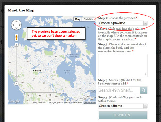
We don't want books to be pinned at the wrong location or placed in a location that didn't match the selected province. The most common cause of a wrongly placed marker would be a user not having moved the marker from its default starting location.
We decided not to show the marker to start, and instead prompt the user to first select a province:
When a province is selected, the map zooms in on the province and the marker is placed in the center of the area.
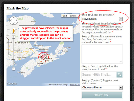
We also have an additional control in place that forces the user to move the pin at least once before the book can be added to the map. This helps to ensure that we don't have a big pile-up of markers in the same spot due to users having forgotten to pin precise, meaningful locations.
2. Consistency with moving parts: zooming in
The normal Google Maps behavior when zooming in is to remain centered to the previous view area. In our case, this is a bit dangerous, as the user can easily zoom in and lose the marker. If we move the marker whenever the user zooms in, this means that the user can become disoriented and lose track of where the marker had previously been. The solution to this problem is to have the zoom behavior depend on the marker's position: in other words, the map zooms in centered around the marker, even if the user had dragged the view area somewhere completely different. Therefore, the marker remains in its previous place but stays visible in the center of the map.
Conclusion
These two considerations helped us to shape the user experience while keeping it intuitive, with the concrete benefit of making the pin locations as accurate as possible.
Check out the map, discover your next read, and pin a book!