Building an accessible website: Contrast
By: Dave Fearnley | February 21, 2017 | Web accessibility
Insufficient contrasting text elements on your website will limit your audience by preventing users who have difficulty distinguishing colours from comfortably consuming your content.
Contrast plays a large role in ensuring the legibility of your website. Developers and designers of accessible websites must carefully consider the colour palettes they use so as not to exclude users with low vision and colour blindness from consuming their content.
It's easy to design an interface that appears to be easy to read, but under closer scrutiny fails to deliver on minimum contrast specifications as outlined in the Web Content Accessibility Guidelines (WCAG). This is becoming more of an issue as the current trend in design is toward muted colours and lighter grey text.
This should be addressed and tested in the design phase of the project, when the colour palette is put in place. If your colours are predetermined by the client's existing corporate colour palette, then you'll want to take care incorporating these colours into elements such as headers, links, and buttons (a company's logo is exempt from the contrast standards).
Contrast limits
The WCAG provides specifications to meet the contrast minimums. These minimums are divided into two levels: AA and AAA. We'll concentrate on the AA specifications for the purposes of this post. To meet WCAG AA standards, the contrast of text to the background must be:
- 4.5 to 1 for text smaller than 18pt (24px)
- 3.0 to 1 for text that is 14pt and bold or larger
The key is to shift your thinking to consider not only the hue, but also the luminosity of your colours as a differentiating factor, that is, how much your colours contrast.
Colour selection tools
There are several tools to help you in finding colours to satisfy both designers and the contrast standards. A good utility for sampling colours and comparing their contrast ratio is the Paciello Group's Colour Contrast Analyser. This tool is available for both MacOS and Windows. It's particularly handy for transforming an existing website into an accessible one. You can either use the colour pickers to sample colours from the existing UI, or you can plug in your colour values (hexadecimal or RGB) directly from your CSS classes to test their contrast.
Is your website accessible to people with disabilities?

Get our beginner's guide to website accessibility
Download your FREE copyThe Colour Contrast Check by snook.ca is an online tool that doesn't include a colour picker, but it does provide sliders for RGB, hue, saturation, and luminosity, which can make the tedious process of tweaking colours a little less time-consuming. As an online tool it does not require installation.
Links
Modern websites tend to eschew the use of underlines to indicate links in their content. This trend presents additional challenges with meeting the WCAG standards. The underline is an effective method for visually impaired users to discern links from regular text. When this distinguishing element is removed, these users may not recognize the links in your content.
The WCAG specifies that in such cases, the colour of the links must contrast from the surrounding text by a factor of 3 to 1. However, the link must still contrast the background by 4.5 to 1. If there is limited or no flexibility with the link colour, you might be tempted to change the brightness of the text, but be careful, the normal text must still maintain its 4.5 to 1 contrast ratio with the background colour. This can be a frustrating and tedious process.
We can illustrate the problem by using our tools to examine a basic setup using the browser default colours:
- Normal text: #000000
- Link: #0000EE
- Background: #FFFFFF
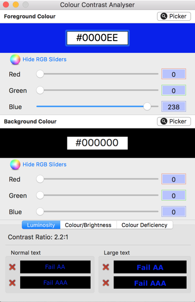
We'll start with plugging our normal text and link colours into the Colour Contrast Analyser:
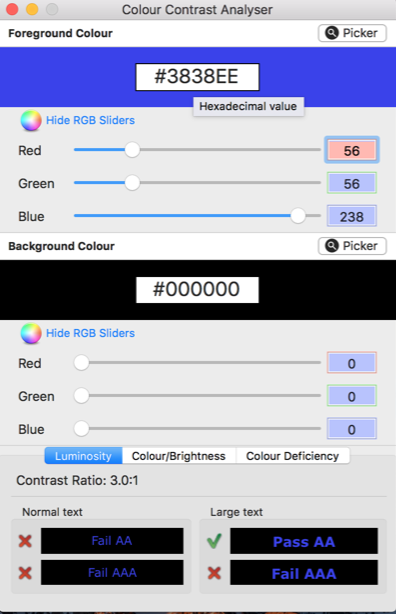
If we remove the underline from links, users will have to depend on the contrast between the normal text and the link text to distinguish their purpose, which as you can see is 2.2 to 1. It must be at least 3 to 1. After some fiddling with the colour analyzer, we can move the contrast to 3 to 1:
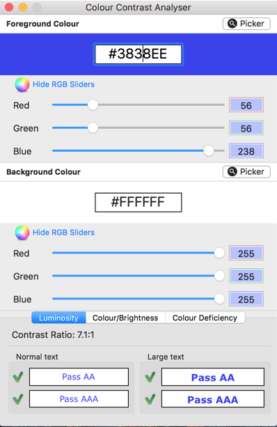
But we're not done! We have to check the new blue against our white background to make sure that it contrasts to our chosen standard (AA 4.5 to 1):
Alternative colour schemes
There will be some cases where a website's colour palette is not flexible enough to handle the contrast restrictions. Perhaps the new colours you have chosen through experimenting with the Colour Analyser do not meet corporate culture or aesthetic ideals.
In this case, a second high-contrast stylesheet can be provided as an alternative to the colours of your website. A link or button must be provided to switch between these themes and this button or link must also meet the contrast minimum rules.
Backgrounds and text
Occasionally an image will be used as the background for text elements. It is possible to achieve an acceptable level of contrast between an image and some overlaying text. However, there are some issues to take note of:
- Images quite frequently display colours that vary from light to dark. If this variance appears underneath your chosen text colour, parts of that content will not meet the minimum levels of the WCAG.
- Is the image replaceable? If editors can change images on your website, they may accidentally undermine the accessibility of the content.
Some solutions are:
- For an image underneath light text, mask the image to mute the variance of colour.
- For an image underneath dark text, fade the image.
The above solutions must still be carefully examined to ensure that all of the content is accessible. Finally, you could provide a shadow around the text to separate it from the image. The shadow's colour will have to contrast with the text at 4.5 to 1.
Maintaining contrast standards
Finally, it is most important that you have strict guidelines for your content editors, developers, and designers regarding the colour of text, links, and backgrounds. Once satisfactory colours are sorted out for how they contrast, these should all be defined in your stylesheet and used exclusively. Custom link and text colours should only be allowed after close scrutiny to ensure that they adhere to the contrast standards established in the WCAG.
Ready to make your website accessible? Sign up to receive a copy of our website accessibility guide or contact us anytime for a free consultation.


